React Native Modals: Sheets vs. Full-Screen Modals Explained

In mobile development, modals are a powerful tool, especially on iOS, for enhancing user experience. A common question I get about my side projects is: “What library do you use for modals?” I rely on two types, sheets and full-screen modals, each with distinct purposes. Let’s break them down with real-world examples and see how to implement them in React Native.
Sheets: Nested and Contextual
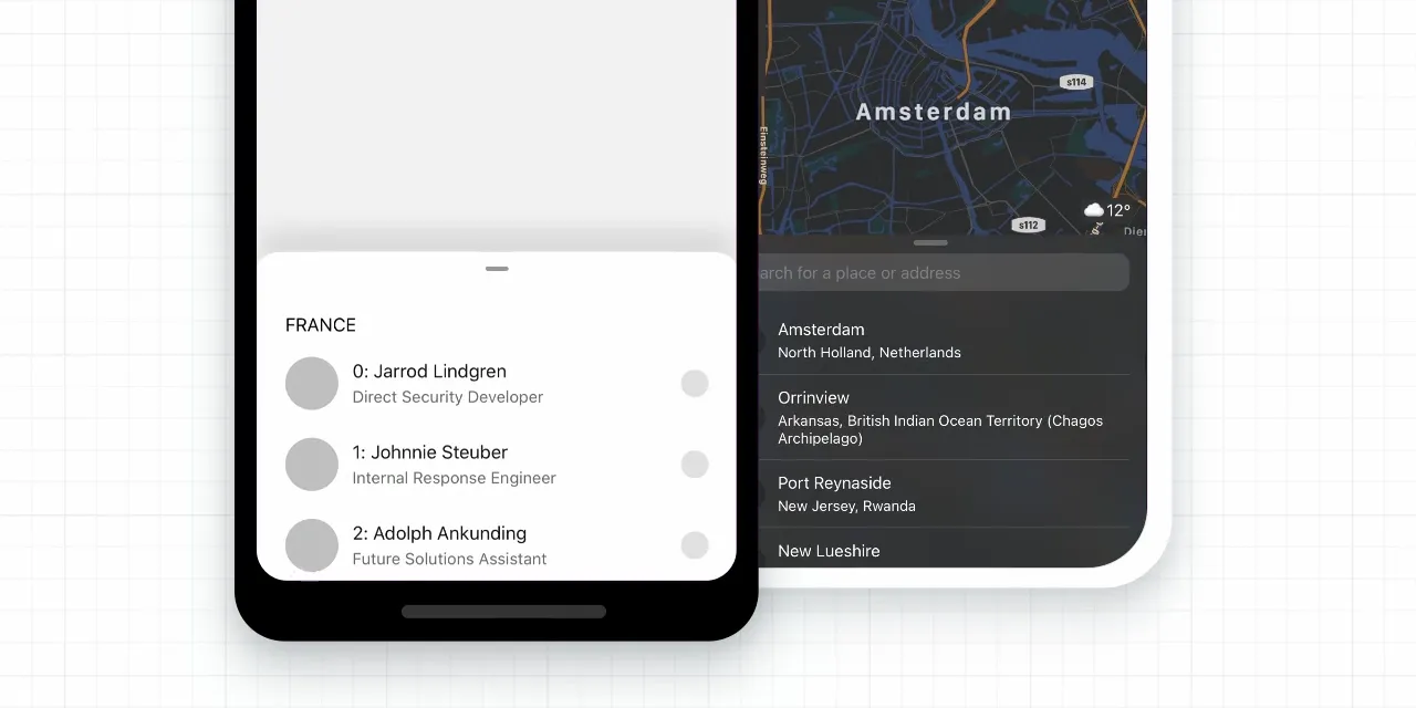
Sheets are modals that slide up within a screen, keeping users anchored to the current context. Take Instagram: when you view comments on a post, a sheet appears instead of a new page. This keeps you on the post screen, making the experience seamless.

I use sheets for features like:
- Filters (e.g., updating search results)
- Comments (e.g., adding to a post)
- Two-factor authentication prompts
Sheets shine when the modal’s state affects the main screen. For example, selecting a filter in a sheet updates the content below once dismissed.
Full-Screen Modals: Independent Screens
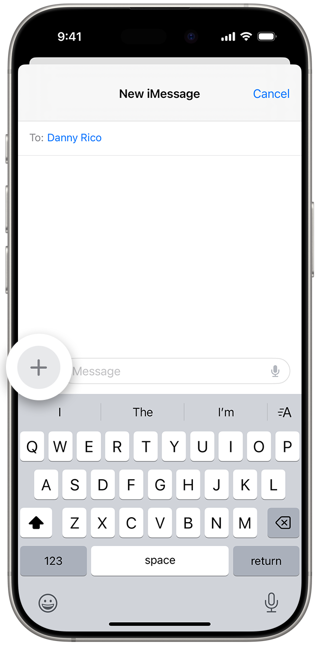
Full-screen modals, on the other hand, act like separate screens. In the iOS Messages app, tapping the top-right icon to compose a new message opens a full-screen modal. It’s a distinct experience from the inbox.
I use full-screen modals for standalone features like:
- Feedback forms
- Account settings
- Terms and conditions
A feedback screen is a perfect case: users enter a description, submit it, and the modal closes, without altering the previous screen’s state. Instagram uses a similar concept (not full-screen, but standalone) when you shake your device three times to report a bug.
When to Use Each
- Sheets: Need state access that impacts the main screen? Go with a sheet.
- Full-Screen Modals: Want an isolated feature with no main-screen dependency? Use a full-screen modal.
Now, let’s implement both in React Native.
Adding Sheets with @gorhom/bottom-sheet
For sheets, I recommend @gorhom/bottom-sheet, a performant, customizable library that works flawlessly with Expo and bare React Native.
Installation
yarn add @gorhom/bottom-sheet
npx expo install react-native-reanimated react-native-gesture-handler
Setup
Wrap your app with GestureHandlerRootView and BottomSheetModalProvider. If you’re using Expo Router, add this to _layout.tsx; otherwise, use App.tsx for React Navigation.
import { GestureHandlerRootView } from "react-native-gesture-handler";
import { BottomSheetModalProvider } from "@gorhom/bottom-sheet";

export default function Layout() {
  return (
    <GestureHandlerRootView style={{ flex: 1 }}>
      <BottomSheetModalProvider>
        <Slot />
      </BottomSheetModalProvider>
    </GestureHandlerRootView>
  );
}
Reusable Sheet Component
To keep styles consistent, I created a reusable Sheet component. Here’s a simplified version:
import React, { forwardRef, useCallback, useImperativeHandle, useMemo, useRef } from "react";
import { BottomSheetModal, BottomSheetView, BottomSheetBackdrop } from "@gorhom/bottom-sheet";

export type SheetRef = {
  show: () => void;
  hide: () => void;
};

type SheetProps = {
  children: React.ReactNode;
  snapPoint: number; // Percentage of screen height
};

const Sheet = forwardRef<SheetRef, SheetProps>(({ children, snapPoint }, ref) => {
  const sheetRef = useRef<BottomSheetModal>(null);

  useImperativeHandle(ref, () => ({
    show: () => sheetRef.current?.present(),
    hide: () => sheetRef.current?.forceClose(),
  }));

  const snapPoints = useMemo(() => [`${snapPoint}%`], [snapPoint]);
  const renderBackdrop = useCallback(
    (props) => <BottomSheetBackdrop {...props} disappearsOnIndex={-1} appearsOnIndex={0} />,
    []
  );

  return (
    <BottomSheetModal
      ref={sheetRef}
      snapPoints={snapPoints}
      backdropComponent={renderBackdrop}
      handleStyle={{ backgroundColor: "grey", borderTopLeftRadius: 13, borderTopRightRadius: 13 }}
      handleIndicatorStyle={{ backgroundColor: "grey" }}
      style={{ backgroundColor: "#FFFFFF", borderRadius: 13 }}
    >
      <BottomSheetView style={{ flex: 1 }}>{children}</BottomSheetView>
    </BottomSheetModal>
  );
});

export default Sheet;
Usage
Import the Sheet, create a ref, and add content:
import React, { useRef } from "react";
import { Button, View } from "react-native";
import Sheet, { SheetRef } from "../Sheet";

const Screen = () => {
  const filterSheet = useRef<SheetRef>(null);

  return (
    <View>
      <Button title="Show Filters" onPress={() => filterSheet.current?.show()} />
      <Sheet ref={filterSheet} snapPoint={70}>
        <View>{/* Filter options here */}</View>
      </Sheet>
    </View>
  );
};
This gives you a reusable sheet with consistent styling and good performance. Customize it further, add headers, tweak colors, as needed.
Caveat
Occasionally, @gorhom/bottom-sheet may struggle to render components like FlatList, FlashList, ScrollView, or TextInput correctly. If you encounter issues , such as scrolling glitches or input focus problems, the library provides specialized components (e.g., BottomSheetFlatList, BottomSheetTextInput) to address these use cases seamlessly.
Full-Screen Modals with Navigation
For full-screen modals, both React Navigation and Expo Router offer built-in support. Here’s how to set one up:
Example with Expo Router
In your navigation stack (e.g., index.tsx or a layout file):
import { Stack } from "expo-router";

export default function Layout() {
  return (
    <Stack>
      <Stack.Screen
        name="terms-and-conditions"
        options={{
          presentation: "modal",
          title: "Terms & Conditions",
        }}
      />
    </Stack>
  );
}
Caveat
The presentation: “modal” option is iOS-only. On Android, it renders as a regular screen. Sheets, however, work consistently across both platforms.
Conclusion
Modals in React Native, sheets and full-screen modals, offer distinct ways to organize screens and features. Sheets are perfect for contextual updates, while full-screen modals excel at standalone tasks. With a reusable sheet component via @gorhom/bottom-sheet and navigation’s modal support, you can implement both quickly and give your app a modern, polished feel. Hopefully, this clears up the modal mystery for your next project!
Try BanKan Board — The Project Management App Made for Developers, by Developers
If you’re tired of complicated project management tools with story points, sprints, and endless processes, BanKan Board is here to simplify your workflow. Built with developers in mind, BanKan Board lets you manage your projects without the clutter.
Key Features:
- No complicated processes: Focus on what matters without the overhead of traditional project management systems.
- Claude AI Assistant: Get smart assistance to streamline your tasks and improve productivity.
- Free to Use: Start using it without any upfront cost.
- Premium Features: Upgrade to unlock advanced functionality tailored to your team’s needs.
Whether you’re building a side project, managing a team, or collaborating on open-source software, BanKan Board is designed to make your life easier. Try it today!