Expo Router Web Best Practices: Lessons from Converting a Mobile App to Web
Over the past six weeks, I’ve transformed my Expo side project from a mobile app to a web app. Along the way, I’ve uncovered key best…

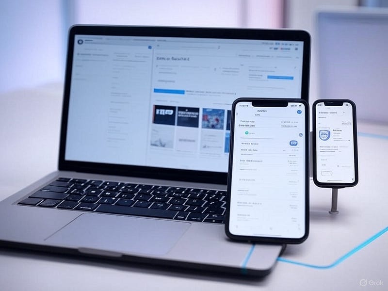
Over the past six weeks, I’ve transformed my Expo side project from a mobile app to a web app. Along the way, I’ve uncovered key best practices, and pitfalls to avoid, for building with Expo Router on the web. Here’s what I’ve learned to help you streamline your Expo web development.
Expo Web Navigation: Ditch the Mobile Tab Bar
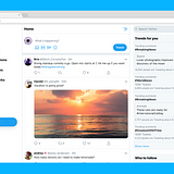
Have you noticed websites don’t use mobile-style tab bars? It’s obvious, yet I stumbled across a Reddit post on r/expo where a moderator suggested reusing the tab bar by moving it to the top. It could work, but customizing Expo Router’s tabs is a nightmare, and workarounds pile up fast.
Evan Bacon, an Expo team member, shared a smarter approach on X: skip the tab stack entirely and use a <Slot /> with a custom header. This simplifies navigation and aligns with web conventions, yet much of the community still pushes the tab bar idea. Let’s break it down.
Create a Web-Friendly Starter Project
- Set Up the Project:
Run yarn create expo-app and choose the “Tabs” template. - Customize Layout:
In (tabs)/_layout.tsx, add a custom Header and Footer around a <Slot />. Here’s an example:
import React from 'react';
import { Slot, Tabs } from 'expo-router';
import FontAwesome from '@expo/vector-icons/FontAwesome';
import Header from '@/components/Header'; // Your custom header
import Footer from '@/components/Footer'; // Your custom footer

export default function TabLayout() {
  if (Platform.OS === "web") {
    return (
      <>
        <Header />
        <Slot />
        <Footer />
      </>
    );
  }

  return (
    <Tabs screenOptions={{ tabBarActiveTintColor: 'blue' }}>
      <Tabs.Screen
        name="index"
        options={{
          title: 'Home',
          tabBarIcon: ({ color }) => <FontAwesome size={28} name="home" color={color} />,
        }}
      />
      <Tabs.Screen
        name="settings"
        options={{
          title: 'Settings',
          tabBarIcon: ({ color }) => <FontAwesome size={28} name="cog" color={color} />,
        }}
      />
    </Tabs>
  );
}
This replaces the clunky tab bar with a clean, web-optimized structure. Trust me, after seeing bad Expo web navigation advice, this clarity is worth sharing.
Web-Specific Components Made Simple
File naming trips up many Expo web developers. Need a web version of a component like HomeFrame.tsx? Here’s the trick with Expo SDK 52:
- Native Version: Rename to homeFrame.tsx (lowercase first letter).
- Web Version: Add homeFrame.web.tsx.
The lowercase convention ensures Expo recognizes platform-specific files. Keep the core logic shared and tweak only what’s necessary for the web, like DOM elements or styling.
Web Modals with Expo Router
Expo Router’s modals work on the web, but they need extra love. Configure modals in app/_layout.tsx with platform-specific styles:
import { Platform } from 'react-native';
import { Stack } from 'expo-router';

const modalStyles = Platform.OS === 'web' ? {
  presentation: 'transparentModal',
  animation: 'fade',
  headerShown: false,
} : {
  presentation: 'modal',
};

export default function Layout() {
  return (
    <Stack>
      <Stack.Screen name="(tabs)" options={{ headerShown: false }} />
      <Stack.Screen name="modal" options={modalStyles} />
    </Stack>
  );
}
Next, wrap modal screens with a reusable ModalContainer for web animations:
import { PropsWithChildren } from 'react';
import { Link } from 'expo-router';
import { Pressable, StyleSheet } from 'react-native';
import Animated, { FadeIn, SlideInDown } from 'react-native-reanimated';

export default function ModalContainer({ children }: PropsWithChildren) {
  if (Platform.OS !== 'web') return <>{children}</>;

  return (
    <Animated.View entering={FadeIn} style={styles.overlay}>
      <Link href="/" asChild>
        <Pressable style={StyleSheet.absoluteFill} />
      </Link>
      <Animated.View entering={SlideInDown} style={styles.modal}>
        {children}
      </Animated.View>
    </Animated.View>
  );
}

const styles = StyleSheet.create({
  overlay: { flex: 1, justifyContent: 'center', alignItems: 'center', backgroundColor: '#00000040' },
  modal: { width: '90%', height: '80%', alignItems: 'center', justifyContent: 'center', backgroundColor: 'white' },
});
Apply this to any modal screen. Now your modals are reusable and polished across web and native!
Link Previews for Web Navigation
Hover over a link on any website, and you’ll see a URL in the bottom corner, called a “link preview” or “status bar link preview.” To replicate this in React Native web with Expo Router, use the <Link /> component with asChild:
import { Link } from 'expo-router';
import { Pressable, Text } from 'react-native';

<Link href="/home" asChild>
  <Pressable>
    <Text>Home</Text>
  </Pressable>
</Link>
Ditch router.push() for navigation. <Link /> enables link previews on web, works on mobile, and works for external URLs too.
Boost SEO with Static Output
For faster load times and better SEO, use Expo’s static rendering. In your app.json, set:
{
  "expo": {
    "web": {
      "output": "static"
    }
  }
}
Run expo export -p web to generate a static build. You might hit dependency snags, but resolving them is worth it for the performance and search engine benefits.
Key Takeaways for Expo Router Web Development
- Replace mobile tab bars with a <Slot /> and custom header and footer.
- Use lowercase file naming (*.web.tsx) for web-specific components.
- Configure modals with platform-specific styles and reusable containers.
- Enable link previews with <Link /> for a web-native feel.
- Opt for static output to optimize speed and SEO.
Converting my app to the web taught me these Expo web best practices through trial and error, my goal is to save you time and frustration! For more on creating responsive designs with Expo web, check out my other article, where I break down my main components for seamless mobile and web layouts using Tamagui. Dive in and streamline your next project!
BanKan Board: Project Management Built by Developers, for Developers
Sick of bloated project management tools with story points, sprints, and endless red tape? Meet BanKan Board, a mobile app designed to cut the clutter and let developers focus on what matters: building great software.
Why Choose BanKan Board?
- No Nonsense: Skip complex processes and manage projects your way.
- Claude AI Assistant: Boost productivity with smart, developer-friendly task support.
- Free to Start: Dive in at no cost, no strings attached.
- Premium Perks: Unlock advanced features tailored for teams when you’re ready.
Perfect for side projects, team workflows, or open-source collabs, BanKan Board keeps it simple and effective. Built by developers who get it, this is the project management app you’ve been waiting for.