Creating Responsive Web and Mobile Designs with Tamagui and Expo
It’s been a while since my last Medium post, and for good reason. Over the past two months, I’ve been revamping my Expo side project to…

It’s been a while since my last Medium post, and for good reason. Over the past two months, I’ve been revamping my Expo side project to support web functionality. With Expo 52 emphasizing web support for React Native, I’ve explored tools to create responsive UI designs for both web and mobile. In this article, I’ll share components, and tips for building responsive layouts, following X’s web layout, using the powerful Tamagui UI library.
If you’re unfamiliar with Tamagui, check out my previous article.
It covers why I love Tamagui and how to set it up in a React Native app.
Initial Setup for Tamagui
Follow the setup guide from my previous article, or follow Tamagui’s Expo Guide, then apply these tweaks:
import { createAnimations } from "@tamagui/animations-react-native";

const animations = createAnimations({
  quick: { damping: 20, mass: 1.2, stiffness: 250 },
});

const config = createTamagui({
  themeClassNameOnRoot: true,
  animations,
  themes: {
    light: { primary: "#228BE6", background: "#FFFFFF" },
    dark: { primary: "#228BE6", background: "#404040" },
  },
  media: createMedia({ xs: { maxWidth: 660 }, sm: { maxWidth: 800 } }),
});
Update or create a metro.config.js:
const { getDefaultConfig } = require("expo/metro-config");
const config = getDefaultConfig(__dirname, {
isCSSEnabled: true, // Enables CSS support for web in Metro
});
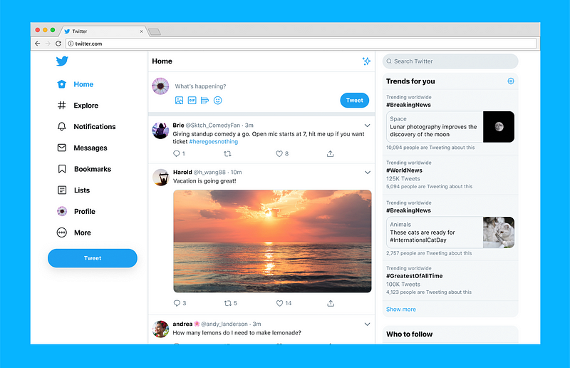
module.exports = config;With Tamagui configured, let’s build a modern Expo web application. For inspiration, I’ll reference the X website, which uses Expo and a three-column layout: navigation, main content, and extra content. My side project follows a similar design, which is simple to implement and great for UI consistency.
PageContainer Component: A Reusable Wrapper
The PageContainer component ensures consistent padding, spacing, and background styles across your app’s pages. Here’s the code:
import React, { PropsWithChildren } from "react";
import { Platform } from "react-native";
import { GetProps, ScrollView, XStack, YStack, styled } from "tamagui";

const Container = styled(YStack, {
  backgroundColor: "$background",
  flex: 1,
  padding: 15,
  gap: "$5",
  variants: {
    padded: { false: { padding: 0 } },
  },
});

const ScrollContainer = styled(ScrollView, {
  backgroundColor: "$background",
  flex: 1,
  padding: 15,
  space: "$5",
  showsVerticalScrollIndicator: false,
  showsHorizontalScrollIndicator: false,
  variants: {
    padded: { false: { padding: 0 } },
  },
});

type PageContainerProps = GetProps<typeof Container> &
  GetProps<typeof ScrollContainer> & {
    scroll?: boolean;
    rightColumn?: React.ReactNode;
    columnWidths?: { leftColumnWidth: `${number}%`; rightColumnWidth: `${number}%` };
  };

export const PageContainer = (props: PropsWithChildren<PageContainerProps>) => {
  const { scroll, columnWidths } = props;

  if (Platform.OS === "web") {
    return (
      <YStack flex={1} height={70}>
        <XStack flex={1}>
          <XStack width={columnWidths?.leftColumnWidth ?? "70%"}>
            <ScrollContainer {...props}>{props.children}</ScrollContainer>
          </XStack>
          {props.rightColumn && (
            <YStack
              width={columnWidths?.rightColumnWidth ?? "30%"}
              height="100%"
              borderLeftWidth={1}
              borderLeftColor="$borderColor"
              backgroundColor="$background"
            >
              {props.rightColumn}
            </YStack>
          )}
        </XStack>
      </YStack>
    );
  }

  return scroll ? (
    <ScrollContainer {...props}>{props.children}</ScrollContainer>
  ) : (
    <Container {...props}>{props.children}</Container>
  );
};
How It Works
- Mobile: Uses Container (static) or ScrollContainer (scrollable) based on the scroll prop.
- Web: Adds a two-column layout with customizable leftColumnWidth and rightColumnWidth percentages.
This handles the main and right content column from X’s design. This is also fully responsive since, we are using percentages for the widths of the columns! Next, let’s add navigation.
NavigationContainer: Adding the Left Column
Here’s a NavigationContainer for a sidebar on web:
import { FolderKanban, Inbox, Notebook, Settings, Home } from "@tamagui/lucide-icons";
import { Image } from "expo-image";
import { Link, usePathname } from "expo-router";
import React, { PropsWithChildren } from "react";
import { Dimensions, Platform } from "react-native";
import { Paragraph, Spacer, Header as THeader, XStack, YStack, useTheme } from "tamagui";
import SideBarLabel from "./SideBarLabel";

const SIDE_BAR_WIDTH = 325;

const NavigationContainer = ({ children }: PropsWithChildren) => {
  const pathname = usePathname();
  const theme = useTheme();

  if (Platform.OS === "web") {
    return (
      <div style={{ flex: 1, height: 61, width: "100%" }}>
        <THeader
          flex={1}
          height={61}
          paddingRight={50}
          flexDirection="row"
          alignItems="center"
          backgroundColor="white"
          borderBottomWidth={1}
          borderBottomColor="#CCCCCC"
        >
          <XStack alignItems="center">
            <Link href="/" asChild>
              <Image
                source={{ uri: "your-logo-url" }} // Replace with your logo
                style={{ width: 160, height: 80 }}
                contentFit="contain"
                priority="high"
                cachePolicy="memory-disk"
                transition={200}
              />
            </Link>
          </XStack>
          <Spacer flex={1} />
          <Link href="/settings">
            <Paragraph>Settings</Paragraph>
          </Link>
        </THeader>
        <XStack>
          <YStack
            height="100%"
            width={SIDE_BAR_WIDTH}
            $md={{ width: 70 }}
            backgroundColor="darkgrey"
            borderRightColor="#CCCCCC"
            borderRightWidth={1}
          >
            <YStack padding={23} gap="$5">
              <SideBarLabel href="/" selected={pathname === "/"} label="Home" icon={Home} />
              {/* Add more SideBarLabel components for other navigation items */}
            </YStack>
          </YStack>
          <YStack flex={1}>{children}</YStack>
        </XStack>
      </div>
    );
  }
  return <>{children}</>;
};

export default NavigationContainer;
SideBarLabel Component
import { Link, router } from "expo-router";
import React, { useMemo } from "react";
import { Paragraph, Anchor, XStack, useGetThemedIcon } from "tamagui";

type SideBarLabelProps = {
  label: string;
  icon: any; // Icon component or JSX element
  selected: boolean;
  href: string;
};

const SideBarLabel = ({ label, icon, selected, href }: SideBarLabelProps) => {
  const resolvedHref = useMemo(() => (href ? Link.resolveHref(href) : undefined), [href]);

  return (
    <Anchor
      href={resolvedHref}
      hoverStyle={{ cursor: "pointer" }}
      pressStyle={{ opacity: 0.4 }}
      onPress={(e) => {
        e.preventDefault();
        if (resolvedHref) router.push(href);
      }}
      textDecorationLine="none"
    >
      <XStack gap="$4" alignItems="center">
        <SideBarIcon selected={selected}>{icon}</SideBarIcon>
        <Paragraph color={selected ? "black" : "grey"}>{label}</Paragraph>
      </XStack>
    </Anchor>
  );
};

const SideBarIcon = ({ children, selected }: { children: any; selected: boolean }) => {
  const getThemedIcon = useGetThemedIcon({ size: 25, color: selected ? "black" : "grey" });
  const themedIcon = getThemedIcon(children);
  return themedIcon || null;
};

export default SideBarLabel;
Integration in _layout.tsx
import { Platform } from "react-native";
import { NavigationContainer } from "./NavigationContainer";
import { Stack } from "expo-router";

const Layout = () => (
  <NavigationContainer>
    <Stack screenOptions={{ headerShown: Platform.OS !== "web" }}>
      <Stack.Screen name="(tabs)" />
      {/* Add other screens here */}
    </Stack>
  </NavigationContainer>
);

export default Layout;
This gives you a three-column layout on web (navigation, main, extra) and a simple PageContainer on mobile.
Sheet Component: Mobile vs. Web
I use @gorhom/bottom-sheet for mobile sheets (e.g., filters) but switch to Tamagui’s Dialog for web due to rendering issues. Here’s a unified Sheet component:
import React, { forwardRef, useCallback, useImperativeHandle, useMemo, useRef, useState } from "react";
import { BottomSheetBackdrop, BottomSheetModal, BottomSheetView } from "@gorhom/bottom-sheet";
import { Dialog, YStack, useTheme } from "tamagui";
import { Platform } from "react-native";
import ModalHeader from "../ModalHeader";
import { PageContainer } from "../PageContainer";

export type SheetRef = { hide: () => void; show: () => void };

type SheetProps = {
  children: React.ReactNode;
  title: string;
  snapPoint: number;
  padded?: boolean;
  webWidth?: number;
};

const Sheet = forwardRef<SheetRef, SheetProps>(
  ({ children, title, snapPoint, padded = true, webWidth = 450 }, ref) => {
    const [open, setOpen] = useState(false);
    const sheetRef = useRef<BottomSheetModal>(null);
    const theme = useTheme();

    useImperativeHandle(ref, () => ({
      hide: () => {
        sheetRef.current?.forceClose();
        setOpen(false);
      },
      show: () => {
        sheetRef.current?.present();
        setOpen(true);
      },
    }));

    const snapPoints = useMemo(() => [`${snapPoint}%`], [snapPoint]);
    const renderBackdrop = useCallback(
      (props: any) => <BottomSheetBackdrop {...props} disappearsOnIndex={-1} appearsOnIndex={0} />,
      []
    );

    if (Platform.OS === "web") {
      return (
        <Dialog open={open} onOpenChange={setOpen}>
          <Dialog.Portal>
            <Dialog.Overlay
              backgroundColor="#555"
              opacity={0.7}
              animation={["quick", { opacity: { overshootClamping: true } }]}
              enterStyle={{ opacity: 0 }}
              exitStyle={{ opacity: 0 }}
            />
            <Dialog.Content
              padding={0}
              borderRadius={10}
              overflow="hidden"
              borderWidth={0}
              animateOnly={["transform", "opacity"]}
              animation={["quick", { opacity: { overshootClamping: true } }]}
              enterStyle={{ x: 0, y: -20, opacity: 0, scale: 0.9 }}
              exitStyle={{ x: 0, y: 10, opacity: 0, scale: 0.95 }}
              shadowOpacity={0}
            >
              <YStack backgroundColor="$background" maxHeight={750} width={webWidth}>
                <ModalHeader title={title} onClose={() => setOpen(false)} />
                <YStack flex={1} padding={15}>
                  {children}
                </YStack>
              </YStack>
            </Dialog.Content>
          </Dialog.Portal>
        </Dialog>
      );
    }

    return (
      <BottomSheetModal
        ref={sheetRef}
        backdropComponent={renderBackdrop}
        snapPoints={snapPoints}
        containerStyle={{ backgroundColor: theme.background.val }}
        handleIndicatorStyle={{ backgroundColor: "white" }}
        style={{ backgroundColor: theme.background.val, borderRadius: 13 }}
      >
        <BottomSheetView style={{ flex: 1 }}>
          <PageContainer backgroundColor="$background" padded={padded}>
            {children}
          </PageContainer>
        </BottomSheetView>
      </BottomSheetModal>
    );
  }
);

export default Sheet;
ModalHeader Component
import { X } from "@tamagui/lucide-icons";
import React from "react";
import { Paragraph, Square, XStack } from "tamagui";

type ModalHeaderProps = { title: string; onClose: () => void };

const ModalHeader = ({ title, onClose }: ModalHeaderProps) => (
  <XStack width="100%" padding={20} alignItems="center">
    <Paragraph flex={1} fontSize={24} lineHeight={24} fontWeight="bold">
      {title}
    </Paragraph>
    <Square
      backgroundColor="$frameBackground"
      pressStyle={{ opacity: 0.4 }}
      padding={5}
      cursor="pointer"
      borderRadius={5}
      onPress={onClose}
    >
      <X color="white" />
    </Square>
  </XStack>
);

export default ModalHeader;
Sheet Usage Example
import { useRef } from "react";
import { Paragraph } from "tamagui";
import Sheet, { SheetRef } from "./Sheet";
import { PageContainer } from "./PageContainer";

const Screen = () => {
  const sheetRef = useRef<SheetRef>(null);

  const handlePress = () => sheetRef.current?.show();

  return (
    <Sheet ref={sheetRef} title="Test Sheet" snapPoint={70}>
      <PageContainer>
        <Paragraph>Test</Paragraph>
      </PageContainer>
    </Sheet>
  );
};

export default Screen;
Tooltip Component: Web-Only Enhancement
Add tooltips for web with Tamagui:
import React, { PropsWithChildren } from "react";
import { Paragraph, Tooltip, YStack } from "tamagui";

const ToolTip = ({ children, content, onPress }: PropsWithChildren<{ content: string; onPress: () => void }>) => (
  <Tooltip placement="bottom" delay={{ open: 0, close: 0 }}>
    <Tooltip.Trigger>
      <YStack
        padding={10}
        borderRadius={5}
        hoverStyle={{ backgroundColor: "#d9d9de" }}
        cursor="pointer"
        onPress={onPress}
      >
        {children}
      </YStack>
    </Tooltip.Trigger>
    <Tooltip.Content
      enterStyle={{ x: 0, y: -5, opacity: 0, scale: 0.9 }}
      exitStyle={{ x: 0, y: -5, opacity: 0, scale: 0.9 }}
      animation={["quick", { opacity: { overshootClamping: true } }]}
      themeInverse
      paddingHorizontal={14}
      paddingVertical={12}
    >
      <Tooltip.Arrow />
      <Paragraph>{content}</Paragraph>
    </Tooltip.Content>
  </Tooltip>
);

export default ToolTip;
Wrap any component with ToolTip to show a hover tooltip on web.
Real-Life Example: BanKan Side Project
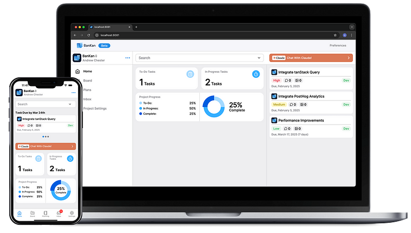
My side project BanKan, brings these concepts to life using the components above. On the web, it features a three-column layout navigation, main content, and extra content replacing the mobile tab bar. For instance, instead of displaying “Tasks Due by Mar 24th” in the main column, I shifted it to the right column. To keep the mobile experience clean, I added a simple Platform.OS !== “web” check to hide these tasks on web. This demonstrates how reusable Tamagui components streamline responsive design across web and mobile platforms.
Conclusion
This isn’t a full tutorial to recreate X’s website, but these Tamagui components PageContainer, NavigationContainer, Sheet, and ToolTip simplify building responsive designs for web and mobile. They’ve saved me time converting my mobile app to a web app, and I hope they help you too!
Try BanKan Board — The Project Management App Made for Developers, by Developers
If you’re tired of complicated project management tools with story points, sprints, and endless processes, BanKan Board is here to simplify your workflow. Built with developers in mind, BanKan Board lets you manage your projects without the clutter.
Key Features:
- No complicated processes: Focus on what matters without the overhead of traditional project management systems.
- Claude AI Assistant: Get smart assistance to streamline your tasks and improve productivity.
- Free to Use: Start using it without any upfront cost.
- Premium Features: Upgrade to unlock advanced functionality tailored to your team’s needs.
Whether you’re building a side project, managing a team, or collaborating on open-source software, BanKan Board is designed to make your life easier. Try it today!